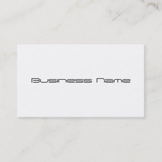
Not everyone wants a flashy Business Card. Instead they prefer to let their name stand out in simple classic style. Here are the first of my new Minimalist Business Cards. With these I managed to tone it down and keep it simple. All the contact info is moved to the back leaving the front to showcase your brand name. The fonts can be change with several styles and colors to choose from.
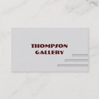
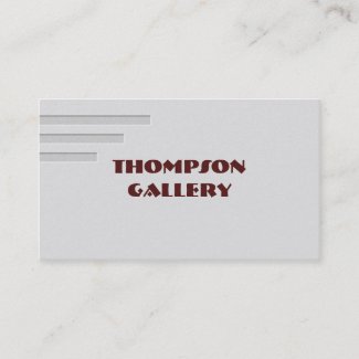
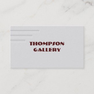
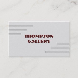
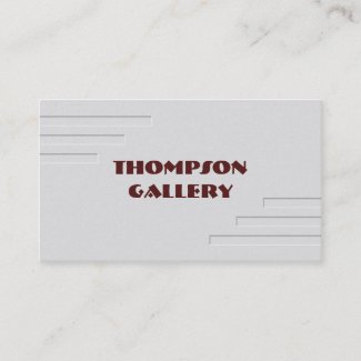
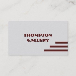
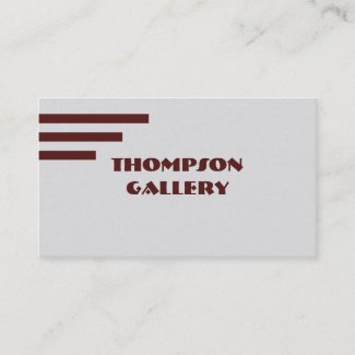
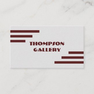
Here a four variations in a Modern style all having a very slightly speckled Grey background. Three of the four include short Brown stripes. I used a matching Brown font which may be changed to a color and style of your choosing. EDIT: I enjoyed creating this design so much that I had to take it a step further with a nice pressed effect! See the updated cards below
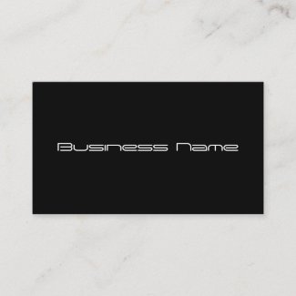
The next two are elegantly simple Black and White. Of course if you click the Customize button on the product page they can be whatever color you wish. On the customize page the card color can be changed by clicking Edit then Background. The font color is changed with the square color swatch next to the font choice.
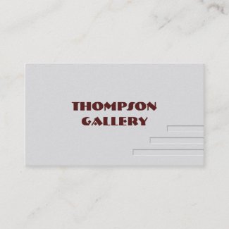
Updated Business Cards
These updated cards have a pressed effect. Note this is an printed effect and not actual pressing or embossing though as you can see it still looks great.


No comments:
Post a Comment